
You’re going to learn about a neat dashboard with which you categorize social media posts. With this dashboard you will have a direct overview of your posts and you can see what kind of content really resonates with your followers.
This goes beyond the typical ‘video vs image’ or ‘normal post vs link post’. This is tailored to what works best for your social media content.
Here’s an example of what that would look like:
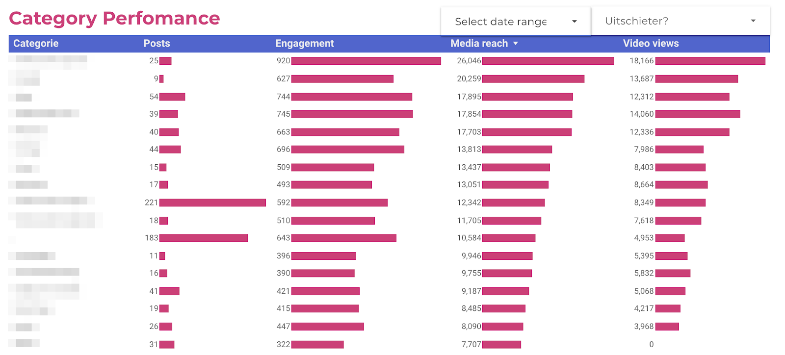
This table is sorted on ‘Media reach’, which is 100% organic. Thanks to this dashboard, we found out that certain types of post consistently had twice the amount of organic reach. Furthermore, one of the most time consuming type of content we produced was always underperforming. We clearly had a lot to figure out after seeing these numbers.
In this article you’ll find out exactly how I created this dashboard so you can do the same.
| THE BREAKDOWN | |
|---|---|
| Social | Tweede Divisie Instagram |
| Product | Official social media channels of sportscompetitions |
| Industry | Sports |
| Result | A clear overview of what differend kind of content is working on social media so you know where to invest in more or less time for better results. |
| Tools | Google Data Studio, Supermetrics for Google Sheets |
| Skills | Social media, Google Data Studio, data analysis |
What you'll learn
Use Supermetrics and dive into Google Sheets
How to start? I used a tool called Supermetrics for Google Sheets to export all social media post metrics to …. Google Sheets (didn’t see that coming, did you?).
You’ll get something like this:
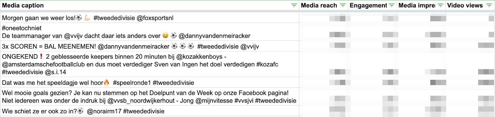
If you don’t want to pay €70 per month for Supermetrics, it’s important that you have the post and the views in the same row. That’s all you need to continue.
Categorize your posts
The next step is to add a column called ‘Category’. With this column you will indicate in which ‘bucket’ the post falls. The categories you will use are highly dependent on the content you are creating. In our case, we are posting content about the highest soccer amateur division of the Netherlands. Categories we were making were:
- Goal of the week
- Bloopers
- Aggressiveness
- Single goal
- Derby item
- In-depth preview of game
- Image of the standings
Here’s the sheet with the added column:
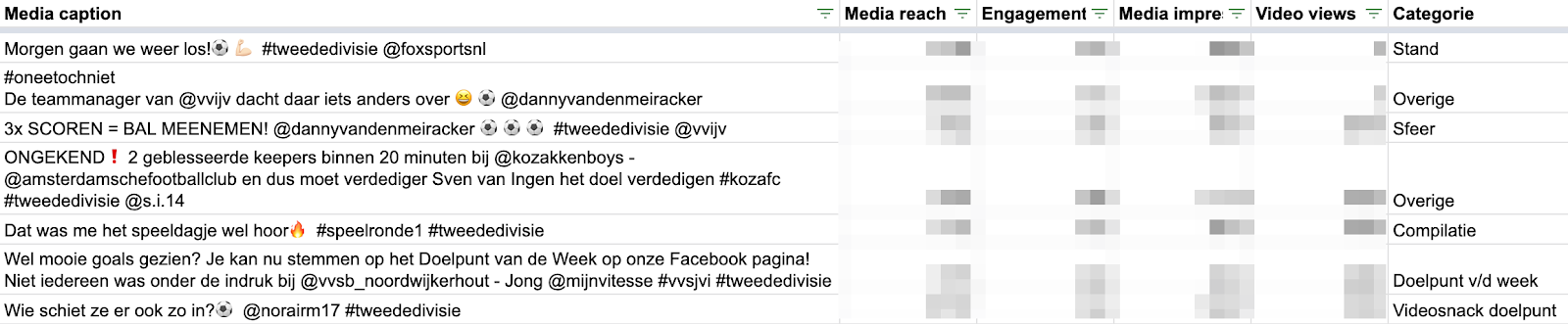
You’ll have to manually add the categories. To categorize 600 posts a full year I had to set apart a full morning, consuming ±5 coffees, doing the same repetitive thing over and over again. Sometimes you can spot the category in the posts via the text or the hashtag, other times judge it with your own eyes.
Although it might seem a hussle at the start, the work will definitely be worth it eventually. Just prepare to do the boring work, so you can actually do the juicy analysis work.
After categorizing every post we can now go to Data Studio.

Get everything into Google Data Studio
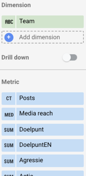
Now go into Google Data Studio. Connect the sheet as a source. Get a new column in. The metrics should be the reach, engagement, views, etc. As dimension select ‘Category’. Voilà! There you go.
What to do with the results?
You shouldn’t relentlessly follow the data and cut all content categories which perform below average. What categories of content you past has also to do with the brand image you want to create.
Consider what has a good fit of your brand and has good performance. If something doesn’t link back to your brand or underperforms, kill it as soon as possible.
Another element you should consider is the investment you made to create the piece of content. It can be that the angle/message of your content doesn’t resonate and/or it can be that the item is too labor intensive for it’s performance.
To keep in mind
When you are summarizing the rows in Datastudio always use the median instead of the average. The median give a better image of a result you’ll actually get, instead of a result skewed by posts that went virals.
To furthermore decrease the effect of viral posts, you can add a column name ‘Outlier’. Make a rule, e.g. “=IF(B2>50000, ‘Outlier’, ‘No outlier’)”. This way you can also filter out outliers to have a look if there’s a common denominator or category between the posts.
Adding customized dimensions
Adding a category is not the only thing you can do to differentiate the content. Is there another dimension you can add? Since we had a social media account representing a whole soccer competition, 99% of our posts included soccer clubs.
Adding an extra dimension depends 100% on your social content.
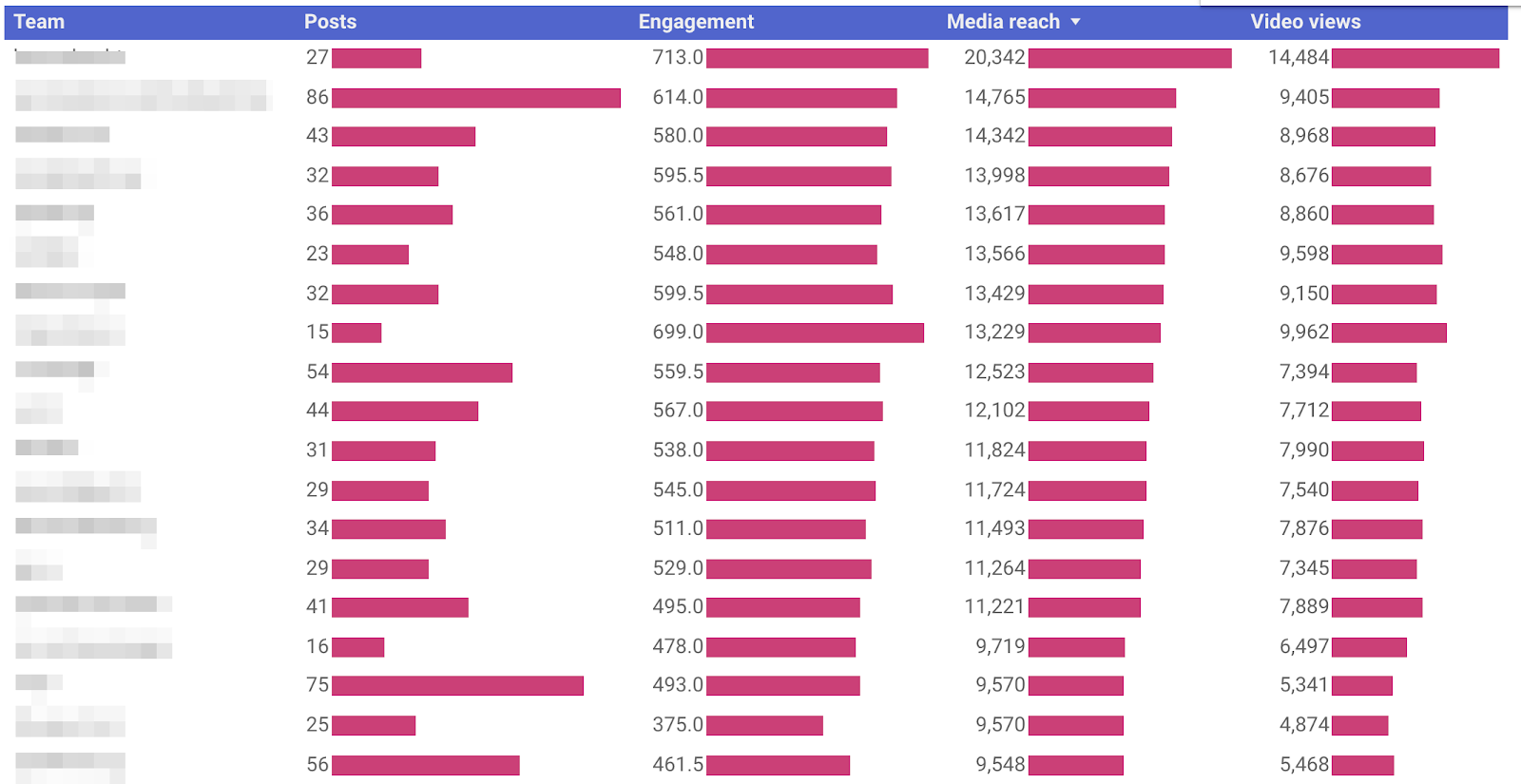
Here’s the table with ‘Team’ as a dimension:
Let me first tell you about how the method, afterwards the implications.
Adding this dimension was way more complicated to figure out. Why? Since one post can have multiple teams (most of the time two). After a lot of number crunching I figured out how to do it.
- Start with a new sheet.
- Duplicate every post which has multiple teams. Even though the post is now in the sheet twice, it’s attributed independent to the two different teams!
Now the results. What to do with it? This graph alone? Not much. The reason is that I’m not sure if the team they see in a post is really the reason people engage with a post. I think the angle (read: category), originality and emotion is something people interact with, not the team. Then why are there still such big differences between teams and media reach? Glad you asked!
Adding a second category dimension
Here, I cross-linked the teams to the categories. This way I could explain why teams were ranking high or low.
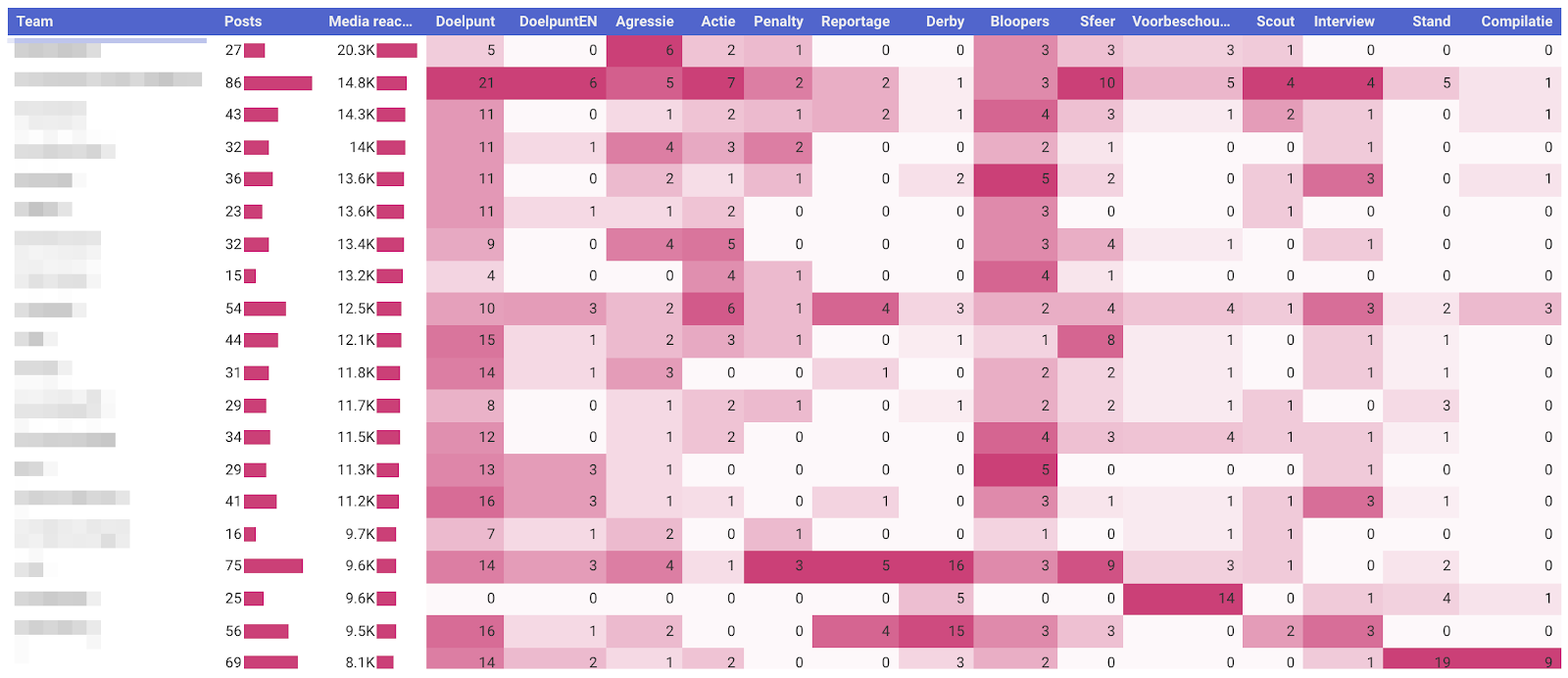
For instance, on Instagram the category ‘Derby’ was a very bad performer. No wonder that the two teams with all the derby posts were also bad performers. On the other hand, aggressive content is a gold mine (people don’t show their best side on social media…). What a coincidence that the best performing team had the most posts in the category ‘aggressive’.
How did I do this? In the same sheet as where I linked teams to all the posts, I made a VLOOKUP formula to the other sheet to get the categories in. After doing this, I had to turn the categories into binary values. I added as many columns as I had categories. For the ease of the formula, let’s assume column E is where the category is in: “=IF(E2=’CategoryA’,1,0). You have to make this formula for every category. In Google Data Studio, use the settings to the right. Make sure the categories are summed.
Social media dependency
As a business, you don’t want to become dependent (read: >50% of revenue comes from social media channels). This is because you’re on someone else’s platform. Look at the constant decrease of organic reach on Facebook and Instagram.
There are industries like sports, events, fashion and entertainment, to name a few, that do have a so called “channel fit” with social media. Just keep this image in mind. 👇

Need help? Want to dive deeper? Let me know by getting in touch.