In optimising our websites, we’re often optimising for the completely wrong things. Lots of frameworks out there are generic, based on best practices or based on a single case study.
In this blog I want to take 5 steps back.
In what state of mind is your customer coming to your website? Emotional or rational? Are you winning the hearts (system 1) or the minds (system 2)?
You’ll find out when you have to optimise for the hearts and when you have to optimise for the mind, linking it to Daniel Kahneman’s system 1 and system 2.
At every moment in time, both system 1 and 2 are active. You’ll find out which system you can tackle for those CRO uplifts. As an added bonus you get tons of optimisation examples to implement today.
What you'll learn
How to know for which system you need to optimise
The most used system is system 1, important is that you’re not in control. You can not explain why system 1 makes you feel the way you do, because explaining, is system 2 work.
System 2 is conscious, system 1 isn’t. So it’s impossible to truly explain it. We can only explain system 1 behaviour via research outcomes. System 2 is often trying to rationalize the decision of system 1, but it can’t, often it was an emotional decision, not a rational one.
Even seemingly rational decisions are influenced by emotion. As a result, you simply aren’t as in control of your emotions and decisions as you think you are. None of us are!
You have to optimise for system 1 if 1 of these applies:
- Have a lot of low-intent visitors.
- A low price for your product/service.
- Visitors come onto your site in an emotional state (sometimes research is needed to find this out).
System two is important if you have any of these:
- The truly best product. Competing products have nothing on you.
- A complex product that needs a lot of explaining or is difficult to use.
- An expensive product with a big financial commitment.
- High intent visitors that have already made the rational decision of buying your product beforehand.
It’s important to note that both systems work together. You can’t leave one system out of the equation or ignore one part of the brain. I wish. However, you can optimise your site to more deliberately call upon a system and trigger either rational thinking or internal emotions.
Optimisations to implement per system
System 1
System 1 is all about using emotions. The more emotions you can pack into your message, the better. Logical arguments don’t persuade the reptilian brain, simple emotional appeals do the work. Visuals do a lot of the heavy lifting here so that the brain can process everything easily. The first step is:
Getting the emotion right
Before you can start with the tricks, the biggest win here is knowing what emotion you should trigger. Conduct qualitative research to better understand your audience. What’s their emotional range? What are they feeling when they arrive on your site? The answer is never ‘none’.
If you know the right emotion. Make sure:
- Your value proposition makes an emotional appeal and presents an emotional benefit.
- Use contrast here. Don’t just describe the benefits of your product, describe the contrast between using it and using an inferior product or nothing at all. If possible, show this visually to increase impact.
- Use trigger words throughout your copy (especially headlines).
- Make sure your images, people and colours appeal to the emotion. If people feel sad when coming to your site, use happy imagery, if they feel unfulfilled, show them imagery of fulfilled people. Be aware of image size, color, body language and facial expressions in your imagery.
If you have the above right, then it’s time for the other tricks below.
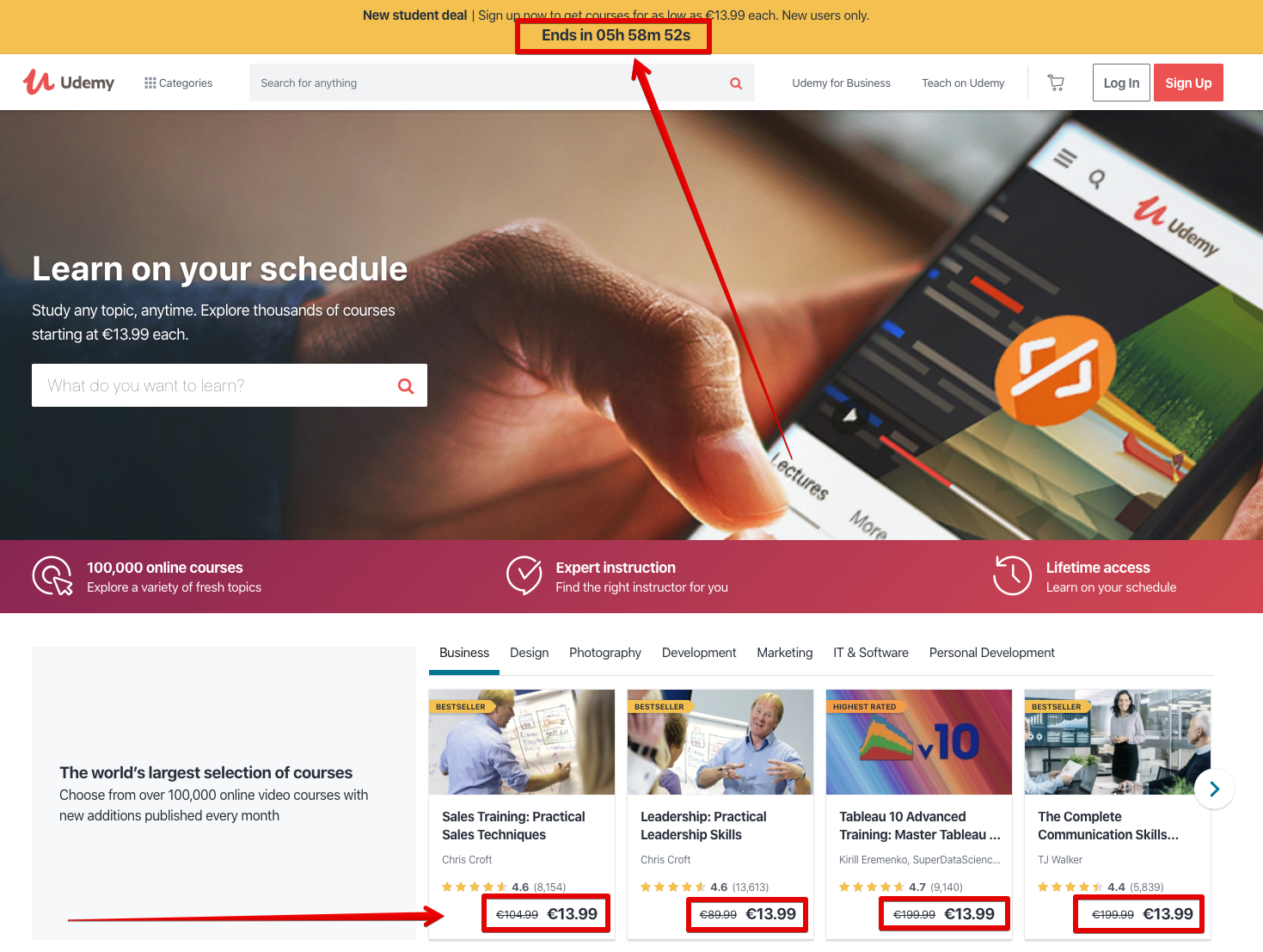
Urgency and scarcity
Everything that puts a (hypothetical) deadline to the buying cycle of the user, works on system 1. It’s pure emotional. Eventbrite’s ‘We hold this ticket for 5 minutes’ or Booking’s ‘2 rooms left’ all put some fire under your ass and cause a lot of stress.
Stress activates system 1, so this causes people to be guided by their emotions.
Peak-end rule
The user will only remember two phases in the whole funnel: the peak and the end. The peak is when emotions are the highest. Both negative and positive. So if there’s a small bug which frustrates the user, he/she will remember. If there’s a (small) pleasurable surprise, the user will remember. A long, slow step in the customer journey? Your customer will remember.
Next to the peak, make sure you always leave the customer on a good note. After checkout, can you give extra value in the form of e.g. a cheerful message or a coupon?
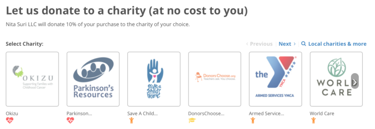
You just ordered and now you can donate for FREE to a charity? What a great way to feel good about yourself.
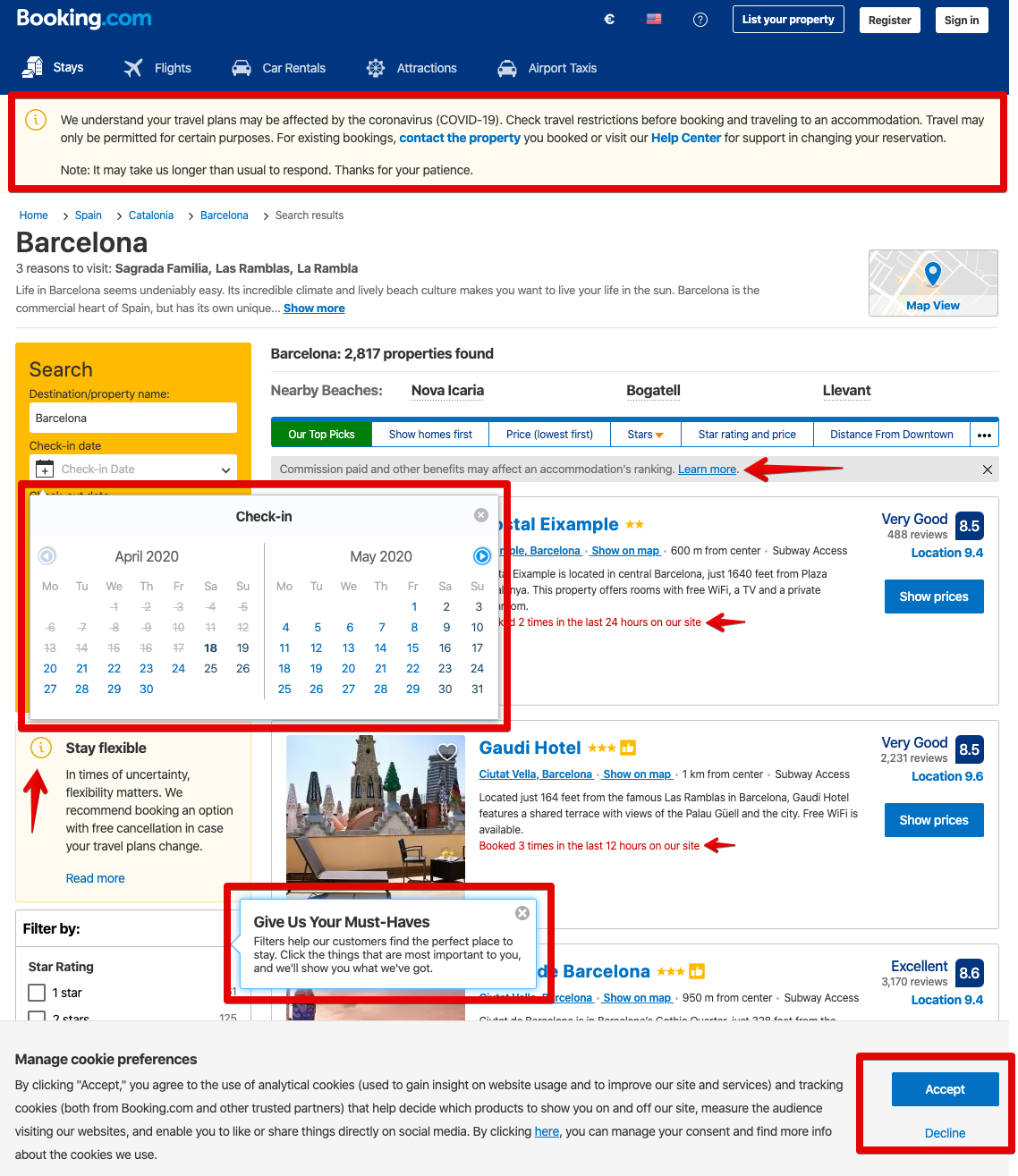
Deplete system 2
Deplete it, so the user will make a non-rational buying decision. This is exactly why booking.com has such an overwhelming user interface.
This is also the reason why at the supermarket they have all these candies at the cash desk. You just made hundreds of small micro decisions which depleted your system 1. Now it’s time for system 1 to be caught by desire and buy that sweet chocolate bar.
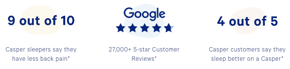
Proof & security
Testimonials, certificates and logos. All visual and recognisable so the person doesn’t have to think about it.

Hell, I even do it myself on my own homepage (twice).
Don’t activate system 2
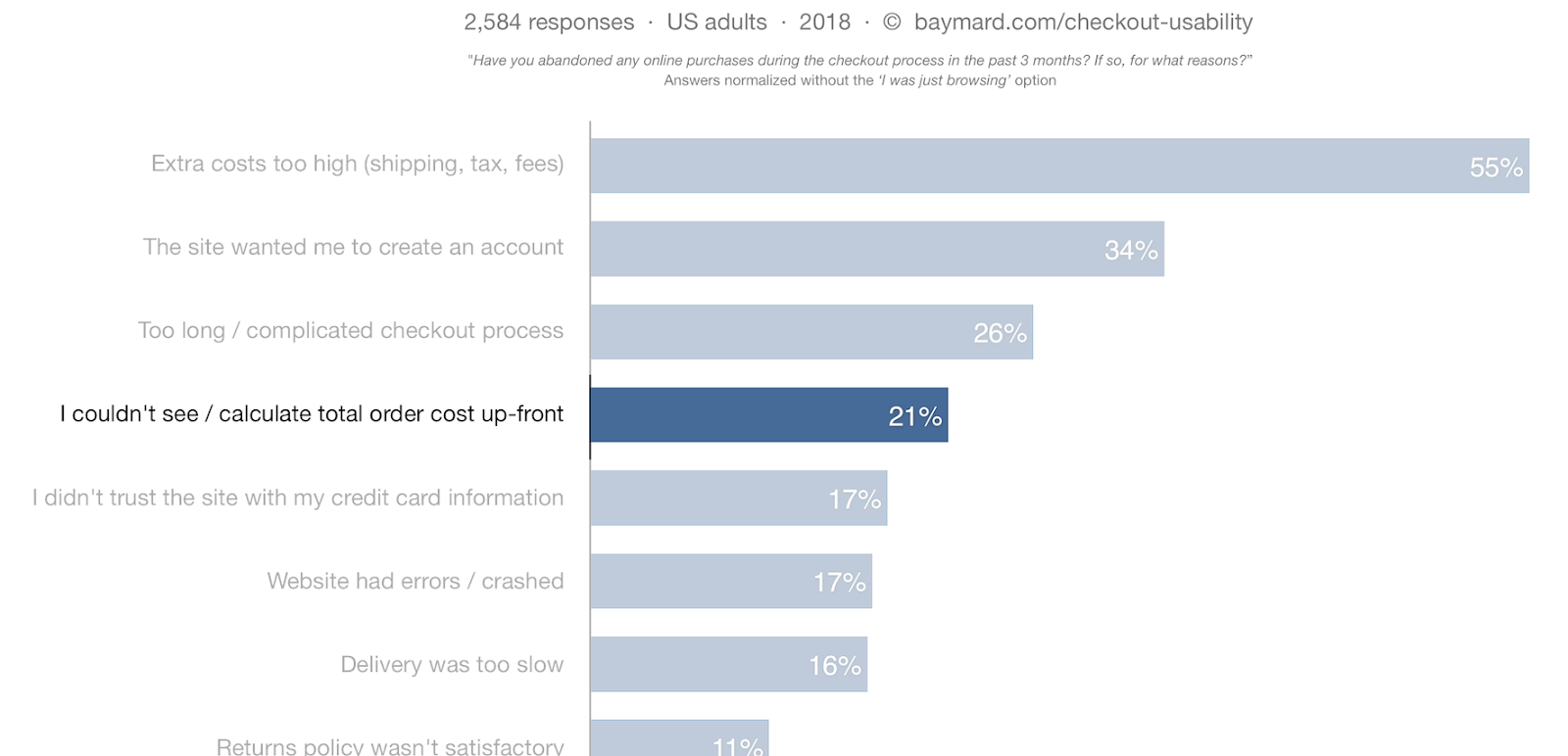
Don’t wake up sleeping dogs. You know why shipping costs are such a killer for your conversions? Not because someone doesn’t want to pay 2 extra euros. It’s because they let the user doubt the whole purchase altogether.
Everything you do that causes people to think rationally, will be a disaster for the conversion rate of your emotional customer journey.
System 2
System 2 is very scarce in resources. So the most important thing is a:
Frictionless experience with intuitive design
Make sure all friction and distraction is gone so the user can make a decision. It’s all about removing friction so you’re not depleting system 2. And very importantly: do not draw the attention away of the visitor.
Here’s how you can apply it:
One single next step
Your visitors need focus. Every choice depletes system 2. You might have multiple next steps, but the single most important action should be as intuitive as possible.
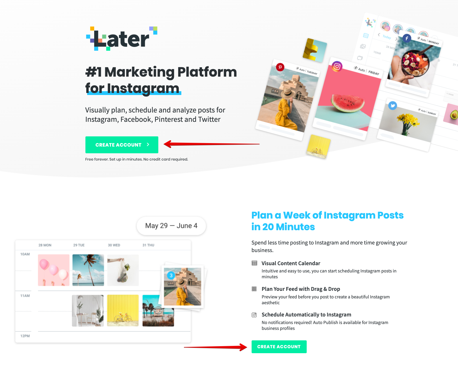
Visual cues
This helps with the previous step. To make it as intuitive as possible and to not let the person think too much. This can be done with arrows (both subtle and less subtle) imagery with eyes looking or people pointing to the button/headline.

Contrast
Be sure the most desirable action stands out and is at the top of the visual hierarchy. Do this via a contrastful colour of the main CTA, but also with stand alone blocks of texts. Make sure it’s not too crowded next to the most important information.
Familiarity
Every website having the same kind of main navigation bar is a good thing. Whenever you land on some new marketing tool, often the first thing you’re looking for is the ‘pricing’ page. It would be confusing if the pricing page suddenly has another name, won’t it? Make sure your navigation matches other sites in your industry.

Pricing, product tours, testimonials, blog and a contrastful button to sign up or make an account is what you see at 90% of all SaaS tools.
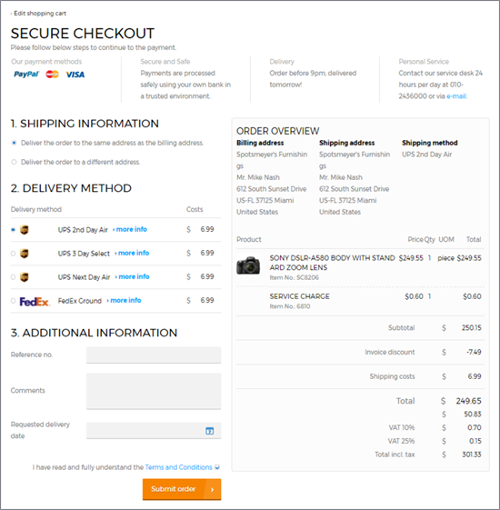
Do the thinking
You want to do the reasoning for the user. Calculate how much money you’re saving for your customer. Calculate the cost per month/week/day for your product so the offer looks more enticing. Offer them a chance to match the quote of your competitor.
There’s no golden rule for everything
Even though this is well researched, always listen to the data. Every specific company, target audience, industry and context is different. So don’t forget to test your ideas.